Geography Inspired by Super Mario and Co.
What cartography can learn from the gaming industry.
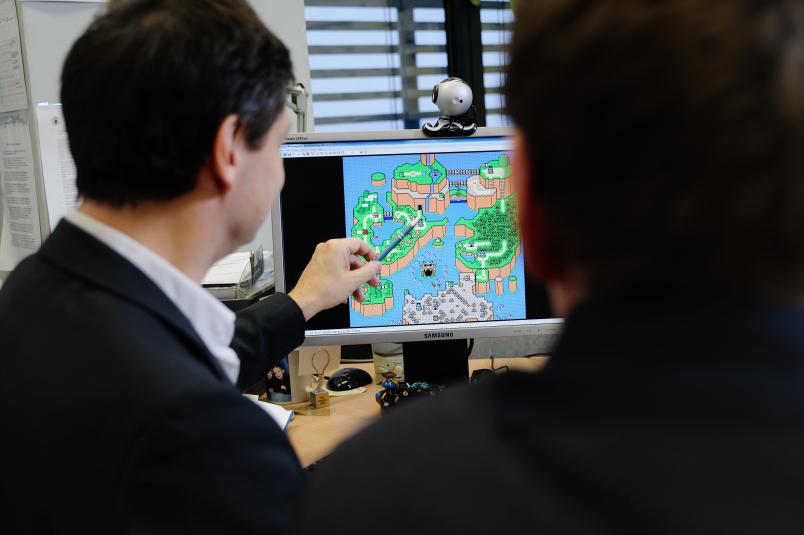
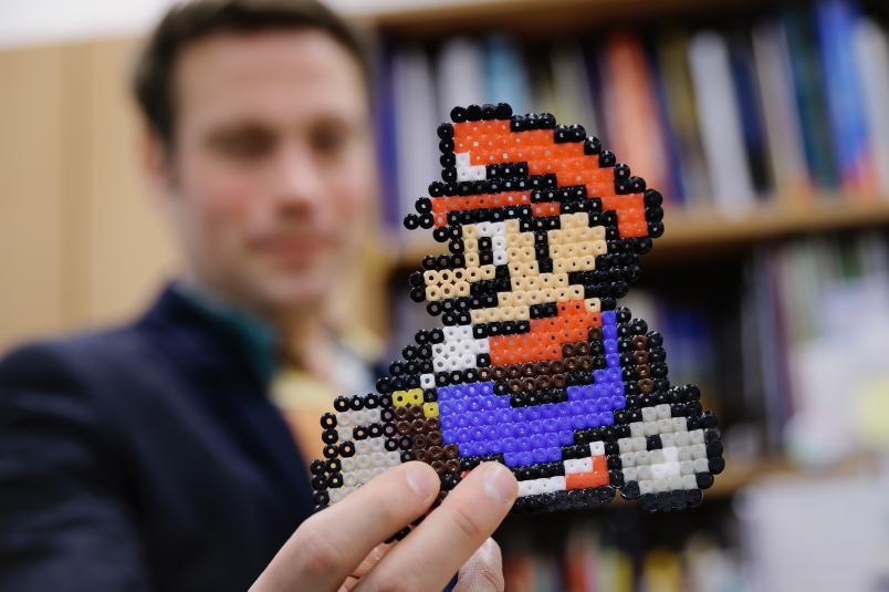
Millions of children and adults played it in the 1990s: Super Mario World. Jumping, running, fighting battles, finding resources, progressing through levels – players experience all these elements in a virtual world, finding their way around intuitively or via brief introductory sequences. The whole world may have been based on a two-dimensional map, but players hardly noticed it, because early tricks simulated depth.
Animated Maps
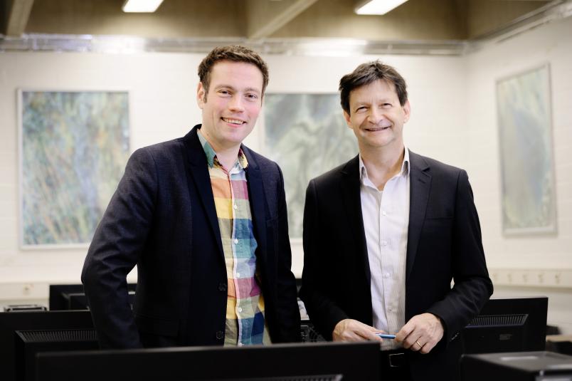
It took years for researchers to discover animated maps and their potential as a subject of scientific study. “Game manufacturers have always been able to try out things that are not accessible to researchers, because the gaming industry makes money hand over fist,” explains Dr Dennis Edler from the Geomatics research group at the Department of Geography at Ruhr-Universität Bochum. Working at the intersection between video games and modern cartography, he analyses the tricks game manufacturers come up with to solve various problems and to represent a plethora of items and elements. He does so with the objective to identify which of these approaches can be used to optimise applications in other fields. Those applications include, for example, geographic information systems or maps for air traffic controllers.
Back to Super Mario World: even this early virtual world had the problem that contents at the edges of the map would disappear from the player’s field of vision when the character moved. What if those contents included important information that the player did not spot or memorise when he first saw them? The makers of Super Mario World solved that problem by enabling the player to move freely and to visit all regions of the map more than once.

What if the user is overwhelmed by too many details or if he doesn’t know where to look first? The solution: acoustic signals such as a short beep are played when a relevant location appears, for example a road junction. A simple colour scheme and clear contents help the user to keep track of things.
The user learns to trust the animated map – which was still a very uncommon feature in the early 1990s – by passing through a brief introductory sequence at the beginning of the game; this step helps him get a grasp of the opportunities offered by the interactive function.
Creating an impression of depth
“Game developers also came up with ideas to render two-dimensional representation graphic and animated,” says Edler. “For example: Super Mario in the foreground moves more quickly than the clouds in the background.” This is how an impression of depth is created. Another innovation was changing the position and size of items represented in the game line by line – this is yet another method to generate a depth effect.
Later plays added new tricks. In order to let a player of football video games keep an eye on the entire pitch, even though he assumed the perspective of his protagonist, a mini-map was displayed in the corner of the screen. “Without that mini-map, the user wouldn’t see where the players are positioned after the goalkeeper has caught the ball and has to return it to the pitch,” explains Dennis Edler. A similar mini-map can be found in racing video games, where players assume the respective driver’s point of view; at the same time, they can see the entire race course in the corner of the screen.
Fog of war restricts user’s perspective
Programmers of real-time strategy games faced quite a different problem, as the first task in this case is to explore the entire landscape. Consequently, a mini-map that represents the entire map would reveal too much information in advance. “Therefore, the makers let the as yet unexplored regions disappear in a so-called fog of war,” says Dennis Edler. Translated to systems utilised in real life, he considers this technology a useful tool for restricting the user’s perspective to the essential aspects. “This could come in handy in maps used by air traffic controllers or by emergency and rescue services operating in disaster areas.”
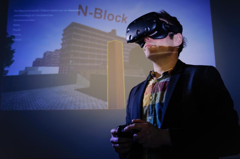
In order to test which applications created by the gaming industry could benefit cartographers, the Geomatics research group analysed the technology underlying first-person shooter games, the so-called engines. The respective enterprises made this code available to the developer community. The researchers used this code to write a programme of their building NA on the RUB campus, which can now be explored with the aid of virtual reality goggles.
“Blown up to include the entire campus, it might one day become a nifty solution for people who intend to visit RUB for the first time, as they could map their way around in advance,” points out Prof Dr Frank Dickmann, head of the research group. “The campus architecture, where all buildings look more or less the same, makes it relatively easy to represent other buildings based on the layout of one.” However, the immense computational power that is required to create a walk through a three-dimensional world is an obstacle that has to be overcome before the idea can be implemented.
Redundant coding of information is useful
In order to identify which animation determines spatial orientation in what way, the researchers are planning to conduct user studies in the next step. The purpose of these studies is to analyse which aspects are considered helpful and which ones distract or disturb the players. In a preliminary study, they have already tested the effect of roads that stand out visually with the aid of 3D monitors. “It emerged that users find it easier to navigate maps if the roads stand out, as it lends maps a stronger texture,” explains Frank Dickmann. Redundant coding of information is likewise useful, for example when place names are represented in the form of text as well as audio information.
“By studying video games, we keep discovering new technologies, which we then evaluate using scientific methods in order to evaluate their potential use in cartography applications,” concludes Dennis Edler.


